Work
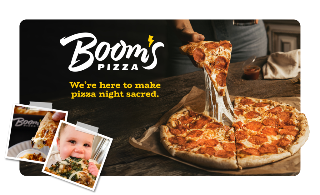
Building a Rebel Brand Identity for Boom’s Pizza
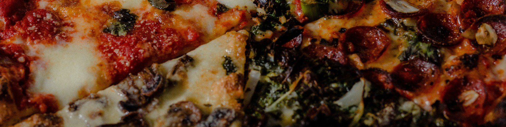
A visual identity and branding for an electric pizza joint.
When a celebrated farm-to-table chef trades white tablecloths for pizza boxes, the brand can’t play it safe. Boom’s Pizza needed a brand identity that could carry culinary credibility without taking itself too seriously. The brand also needed a foundation that would scale beyond a single neighborhood shop.
Muse delivered a bold, personality-driven system rooted in grit, humor, and working-class pride. It’s a brand that feels as electric as it looks, turning a pandemic pivot into a platform for growth, community, and long-term relevance.
Client Context
Boom’s Pizza was founded by Chef Ben Bebenroth, a nationally recognized voice in the fine dining space. After closing his restaurant during the pandemic, he sought a more inclusive concept that could deliver high-quality food to a broader audience at a more accessible price point.
He landed on his next idea: Pizza! Familiar, scalable, and universally appealing, yet still capable of showcasing culinary craftsmanship.
The Challenge: Make Fine Dining Quality More Accessible
The core challenge was translating fine-dining flair into a user-friendly format. We balanced two seemingly opposite goals: maintain the integrity and quality of a fine-dining-trained chef while making the experience approachable and scalable.
Building a Brand From Scratch
Unlike our typical engagements that focus primarily on brand refresh, we crafted an entirely new identity. It needed to stand out in a saturated pizza market and scale across multiple future locations.
Designing for What’s Next
To support Chef Ben’s long-term goals, the brand needed to be:
- Instantly recognizable across regions
- Flexible enough to reflect local community identity
- Operationally simple for multi-unit expansion
We were up for the challenge.
The Solution: A Brand with Bite
A Personality-Driven Brand System
Muse developed a bold, archetype-led identity rooted in the Jester with a sprinkling of the Outlaw. The Jester injected humor, energy, and much-needed approachability; the Outlaw reflected Chef Ben’s irreverence and rejection of convention.
This push and pull created a tone that felt both edgy and welcoming, which differentiated Boom's from traditional pizza competitors.
A Retro-Charged Visual Identity Built for Scale
We knew from the start that this brand needed to scale across different locations and markets. For flexibility, we created a simple, high-impact logo and typography that felt familiar but pushed against the envelope. A simple, yet vibrant, color palette and modular design elements allowed for local customization. This approach gave the brand consistency across locations while leaving room for community expression.
Immersive In-Store Experience
In collaboration with Richardson Design, the brand extended into the physical environment:
- Bold interior design elements and architecture
- Custom wall art
- Distinctive signage
- Tattoo-inspired pizza box artwork
- Graffiti-splattered bathrooms courtesy of the founder’s son
The result was a "homegrown punk" atmosphere that was modern, authentic, and inclusive. The addition of thoughtful touches like free mini dinosaurs brought a fun, family feel to the place as well.
Reframing the Brand Narrative
In a post-pandemic pivot, we decided to replace the original tagline, "born of hard times" with “Pizza night is sacred,” a more resonant positioning centered on joy. It highlighted the shared meals with family and friends, which is central to the brand. This shift aligned the brand with positive emotional connections and fun memories rather than its pandemic-era origins.
The Results: From Pre-Launch Buzz to New Locations
Before opening its doors, Boom’s was already making noise with strong social media momentum and press coverage across Cleveland’s top news outlets. This sparked immediate recognition as something different in the local pizza scene.
This paved the way for early growth and expansion that’s still fueling what’s next. Since brand launch, Boom’s has:
- Opened two storefronts
- Begun developing two additional locations
- Been recognized as a top pizza destination in Northeast Ohio
A Brand That Carries Its Weight
The brand identity has become embedded in the customer experience. It’s not only a business asset, but a feeling that Boom’s lovers rally around.
- Memorable, high-impact visuals that drive foot traffic
- A clear personality that builds emotional connection
- A scalable system ready for expansion
This extends to their social media presence, too, with thousands of followers across Facebook, Instagram, and TikTok. Fans see the Jester and Outlaw archetypes in action!
Industry Recognition
Muse was proud to win a Cleveland Addy for Brand Identity for our Boom’s work. We know this electric brand has a bright future ahead!
Beyond the Brand Identity: Long-Term Impact
Boom’s Pizza proves that a great product might get people in the door, but a great brand identity keeps them coming back, talking about it, and bringing others with them.
What started as translating fine-dining credibility into an approachable format has become a brand built on story, substance, and a willingness to not take itself too seriously.
Boom’s Pizza’s meteoric success underscores a broader shift in hospitality: consumers increasingly seek elevated food experiences at accessible price points, and Boom’s delivers on both.
Rave Reviews.
See what our clients have to say about working with our team.