Work
Mace® Brand Refresh: Reframing Safety for a Modern Consumer
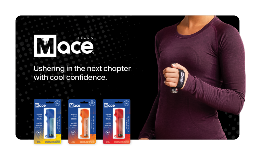
Ushering in the next chapter with cool confidence
Mace® Brand, the category-defining leader in personal safety, faced a critical brand dilemma: should its marketing focus on fear or empowerment? When a new CEO came on board with a mandate to refresh the brand, that question became the creative brief. The goal was a new posture and a new look.
Muse partnered with Mace® to anchor the refresh in one clear idea: preparedness, not fear. The work touched strategy, visual identity, and packaging. We delivered, and Mace® had a boom in new retail accounts, stronger shelf presence, and traction with women and runners. It also set the brand up for a successful acquisition, with equity intact and the story still unfolding.
Client Context
Mace® is the Kleenex of pepper spray. It’s a brand so embedded in the cultural lexicon that people use its name to describe an entire product category. That kind of recognition is hard-won. It's also legally precarious. Protecting the brand meant making sure the world kept saying "Mace® Brand" and not just "mace."
The Challenge: A Legacy Brand at a Crossroads
When the Mace® leadership team came to Muse, the incoming CEO had already identified the tension. The brand's signature red-and-square logo felt alarming—literally. Red signals danger and the boxed-in "M" felt constrictive. For a brand trying to signal confidence and protection, the visual language was working against it. The challenges were layered:
- A fear vs. empowerment brand positioning that hadn't been resolved
- A logo that felt dated and one-dimensional on shelf
- Untapped growth potential with women and active consumers
- Packaging that wasn't pulling its weight in retail environments
- A sale on the horizon, making brand equity part of the valuation story
The ask was to modernize without losing what made the brand matter in the first place.
The Solution: A Modern Identity Built on Preparedness
1. Strategic Repositioning
Research told us what the brand already intuitively knew: consumers don't want to feel scared. They want to feel ready. Fear is reactive. Preparedness is a choice. Muse reframed Mace® around that distinction, shifting the brand narrative from "the world is dangerous" to "you can handle whatever comes next."
2. Visual Identity Redesign
The new identity system had to do something subtle but significant: hold onto the brand's equity while making it feel genuinely new. We kept the square, but opened it up with a pattern symbolic of the spray. We introduced a vibrant, modern blue that reads as trust and calm rather than alarm.
- Vibrant blue as the primary color
- Spray-pattern motif woven into the brand mark, connecting form to function
- Elevated design that reflects Mace® Brand's position as the original, premium offering in the category
3. Scalable Packaging System
The CEO had a clear vision of multiple product colors and a cohesive product family. Vibrant blue gave us a strong primary anchor that could accept other bold colors without losing coherence. The result was a packaging framework that worked across SKUs, traveled well into new retail contexts, and held together as a unified line.
4. Audience Expansion Strategy
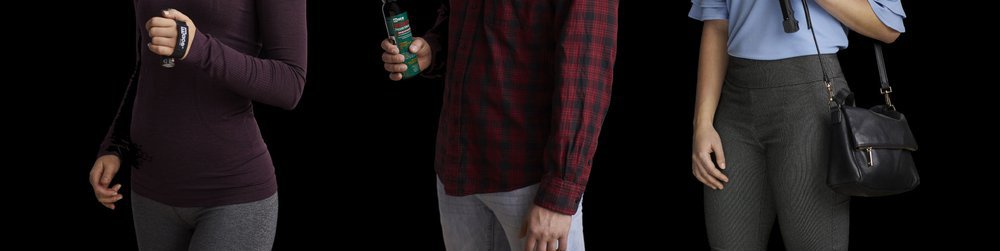
One of the most targeted moves in the engagement was targeting women runners. This precise placement strategy performed. The product was designed to resonate with safety-conscious, active women and placed directly in sporting goods channels.
- Dedicated focus on female consumers, particularly runners
- Sporting goods retail placement
- Packaging and messaging aligned to active, on-the-go lifestyles
5. Brand Equity Protection
This part of the work is easy to underestimate. Mace® is a genericized trademark, like Kleenex or Band-Aid. That's a legal vulnerability. Every touchpoint had to consistently reference "Mace® Brand," include the registered mark on first use, and reinforce that this is a brand name, not a category name. We built those guardrails into the standards and made sure they held.
The Results: Growth, Expansion, and Exit Readiness
The refresh gave Mace® something concrete to bring to retail conversations—and it worked. New accounts came in. The women's runner line found its audience. And when the time came for the company to transition ownership, the brand was in the best shape it had been in years.
Key Outcomes
Business Impact
- Secured new retail accounts after packaging and brand refresh
- Increased adoption among women and runners
- Strengthened shelf presence and product differentiation across the line
Strategic Outcomes
- Repositioned from fear to preparedness for broader consumer appeal
- Elevated brand perception without abandoning
- Created a scalable identity system for future product expansion
- Positioned the company for successful acquisition, with brand equity contributing to valuation
Beyond the Brand Refresh: What’s Next
With a modernized identity and expanded audience base, Mace® is positioned to:
- Extend into adjacent personal safety categories
- Continue scaling retail and e-commerce distribution
- Build on its empowerment-driven brand narrative
CPG isn't our usual territory. Muse typically works with service brands and B2B companies. But Mace® was a rare opportunity: a genuine American legacy brand with real room to grow. The genericization challenge alone was a fascinating problem to solve. We learned, delivered, and we're proud of where this one landed.
Rave Reviews.
See what our clients have to say about working with our team.